
Audiomack
case

Music, with bragging rights.

- Role
- Design system, research, UX/UI, value proposition and information architecture
- Team
- With Sofía Oñate
- Timeline
- 1 semester
- Tools
- Figma
Audiomack is a music streaming platform aimed at young audiences: it champions emerging artists and urban genres for niche listeners looking for new sounds beyond the mainstream. With Sofía Oñate, in the Interfaces Studio, we redesigned its mobile design system.
Problem
To understand what listening on Audiomack is really like, we ran a Google Forms survey focused on perceptions, pain points and usage patterns. Three insights came out of it:
- 01ConfusionThe interface and navigation are confusing and make the experience hard to control.
- 02Key features failSearch and playback break down and cause frustration.
- 03DistrustContent disappears and audio quality is inconsistent.
The app's reviews say the same thing:
- Really bad★★★★★The app keeps deleting music, you always have to download music you already downloaded again, it's useless.
- Terrible app, don't download it★★★★★I downloaded songs and the app deleted them on its own.
- the ads at the bottom★★★★★The ad in the control bar makes it really annoying to control… this didn't exist in the previous version!!!
- So-so★★★★★I've used it for years and there was always music missing or they deleted it, and now I can't find a single song I like.
The player had three overlapping layers of UI competing with each other.
Concept
We set out to remove the visual and functional inconsistencies that wear the experience down, give listeners back control over what they hear, and make discovering music smooth, reliable and frictionless.
First we compared three references to see what to take from each:
- SpotifyScore: 6.2Key dimension FindabilityIts music discovery system and a clear information architecture.
- Emisor PodcastingScore: 5.0Key dimension FindabilityWell-defined categories for discovering niches without relying only on algorithms.
- CooperativaScore: 4.4Key dimension UsefulnessEditorial content organized with a narrative intent.
And we found something about its users: they love to brag that they knew a song before it went mainstream. That is the value proposition.

The interface listens,it doesn't just talk
That's where the system's two principles come from:
- 01DialogueThe interface listens, it doesn't just talk.Other streaming apps talk at the user: the algorithm makes a statement. In Audiomack, exploring stops being a catalog and becomes a conversation about what's happening in the scene before it goes mainstream.
- 02Time as interfaceContextualize instead of categorize.Other apps are organized by genre, mood or popularity. Audiomack is organized by moments: what happened before, what's happening now in the scene and what's emerging. Exploring becomes a living timeline.
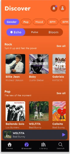
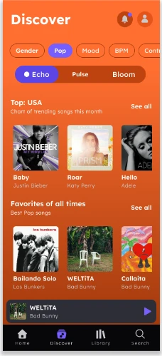
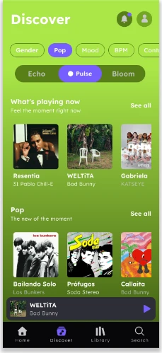
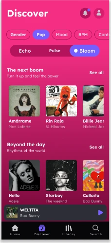
Time becomes color: three temporal accents tint the app according to the moment you're exploring.
- PastEchoWarm and evocative. What you've already heard, to revisit and reconnect with.
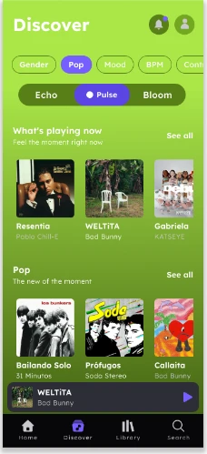
- PresentPulseFresh and active. What's playing right now, in real time.
- FutureBloomVibrant. Emerging trends and sounds that haven't settled yet.
In the navigation map, Discover opens into a Timeline Path with those three moments, and new categories appear, such as Find your Mood, Artist Timeline and an Onboarding Timeline.
Contextualize instead of categorize.
Product
The product is Audiomack's design system: six chapters, from principles to governance, so every screen is built from the same pieces and the inconsistencies go away.
2Style guide
2.1Typography
A single family, Lexend, in thirteen styles: six headlines, two subtitles, two bodies, button, caption and overline. Each style is defined by size, weight and spacing tokens.
- Headline 1
- Headline 2
- Headline 3
- Headline 4
- Headline 5
- Headline 6
- Subtitle 1
- Subtitle 2
- Body 1
- Body 2
- Button
- Caption
- Overline
2.2Color
A primary, a secondary and neutrals built for a dark-first experience, plus the three temporal accents and four feedback colors. Palettes run from 50 to 900; each one's base step is marked.
Brand
- 50
- 100
- 200
- 300
- 400
- 500Base
- 600
- 700
- 800
- 900
- 50
- 100
- 200
- 300
- 400
- 500
- 600
- 700
- 800
- 900Base
- 0
- 50
- 100
- 200
- 300
- 400
- 500
- 600
- 700
- 800Base
- 900
Temporal accents
- 50
- 100
- 200
- 300
- 400
- 500Base
- 600
- 700
- 800
- 900
- 50
- 100
- 200
- 300
- 400
- 500Base
- 600
- 700
- 800
- 900
- 50
- 100
- 200
- 300
- 400
- 500Base
- 600
- 700
- 800
- 900
Feedback
- 50
- 100
- 200
- 300
- 400
- 500
- 600Base
- 700
- 800
- 900
- 50
- 100
- 200
- 300
- 400
- 500
- 600Base
- 700
- 800
- 900
- 50
- 100
- 200
- 300
- 400
- 500Base
- 600
- 700
- 800
- 900
- 50
- 100
- 200
- 300
- 400Base
- 500
- 600
- 700
- 800
- 900
Each palette becomes a set of roles: the color, its container, its fixed versions and the on-color that sits on top. This is how the accents map:
Echo
- Echo
- On Echo
- Echo Container
- On Echo Container
- Echo Fixed
- On Echo Fixed
- Echo Fixed Dim
- On Echo Fixed Variant
Pulse
- Pulse
- On Pulse
- Pulse Container
- On Pulse Container
- Pulse Fixed
- On Pulse Fixed
- Pulse Fixed Dim
- On Pulse Fixed Variant
Bloom
- Bloom
- On Bloom
- Bloom Container
- On Bloom Container
- Bloom Fixed
- On Bloom Fixed
- Bloom Fixed Dim
- On Bloom Fixed Variant
2.3Metrics
Everything is measured on a 4 px scale, from 4 to 72, used as spacing, margin, padding and gap.
2.4Elevation
Four depth levels expressed as shadow, from elevation50 to elevation300: the higher, the deeper.
- elevation50
- elevation100
- elevation200
- elevation300
2.5Shape
Seven rounding steps, from shape-50 to shape-600. Shape is the token and corner-radius its value in px: corner-radius-200 is 12 px, corner-radius-500 is 24 px and corner-radius-600 is 28 px.
- shape-50
- shape-100
- shape-200
- shape-300
- shape-400
- shape-500
- shape-600
3Elements
3.1Icons
Icons are grouped into navigation, action and information, each with its states: enabled, muted, pressed and disabled.
3.2Media
Covers have a placeholder for when they haven't loaded yet and size variants, from a list thumbnail to the player's cover.











4Components
4.1Components
Twenty components, each documented with what it's for and when to use it, its types, variants and states, and the tokens it uses.
- Mini player
- Bottom navigation bar
- Top app bar
- Search bar
- Button
- Icon button
- FAB
- Card
- List item
- Section header
- Tabs
- Chips
- Toggle
- Text field
- Slider
- Page indicator
- Toast
- Overflow menu
- Avatar
- Thumbnail
4.2Library
Every instance lives in the library. Cards come in one version per accent: neutral, Echo, Pulse and Bloom.
5Design patterns
5.1Component lifecycle
Every component goes through the same states, and each state has its token and its motion:
| State | What it says | Token / change | Motion |
|---|---|---|---|
| Default | At rest, ready to interact. | Base surface · color-action-primary-default | — |
| Focus | Keyboard or screen reader focus (inputs). | outline-default + action-primary ring | duration-100 · ease-standard |
| Pressed | Active finger contact. | action-primary-pressed · state-layer · surface-container-lowest | duration-100 · ease-standard |
| Active / Selected | Current destination or choice. | action-primary-default + surface-bright | duration-200 · ease-standard |
| Inactive | Available but not current. | icon-muted · text-muted | duration-200 · ease-standard |
| Disabled | Not interactive, no response. | action-primary-disabled (color, not opacity) | no transition |
| Loading | Content loading. | skeleton: surface-container-high + shimmer | duration-500 · ease-linear (loop) |
Motion follows a duration scale set by the size of the change:
- duration-100100 msMicro-feedback: state-layer, toggle, switch
- duration-150150 msSmall controls: chips, icon-button
- duration-200200 msStandard: buttons, tabs, selection
- duration-300300 msMedium: cards, bottom sheets, expand
- duration-400400 msLarge: navigation between screens
- duration-500500 msEmphasis: player, full-screen overlays
5.2How the interface moves
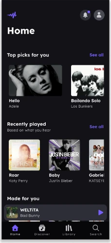
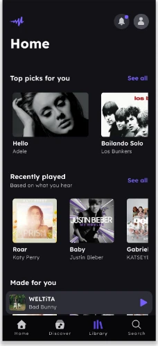
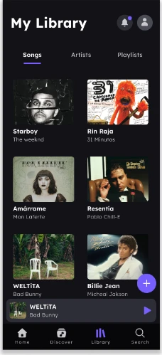
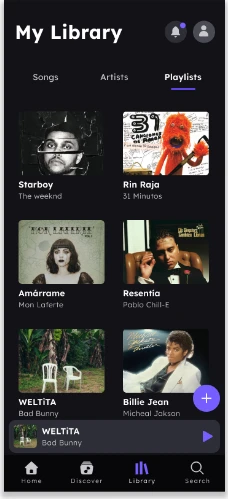
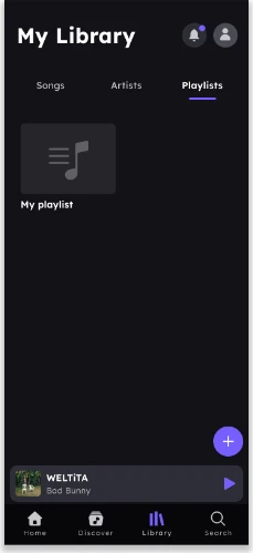
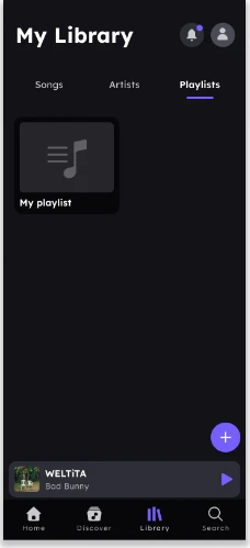
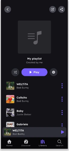
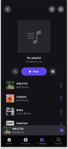
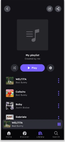
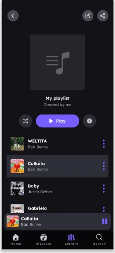
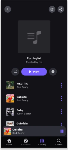
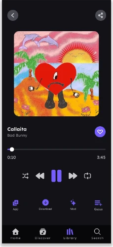
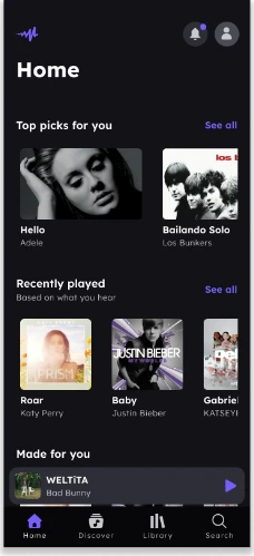
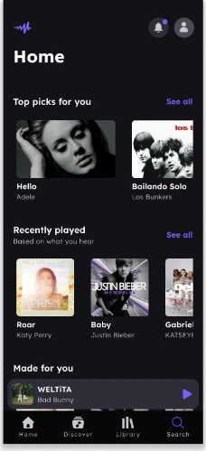
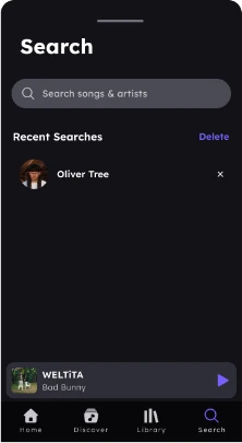
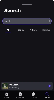
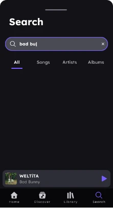
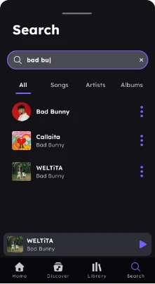
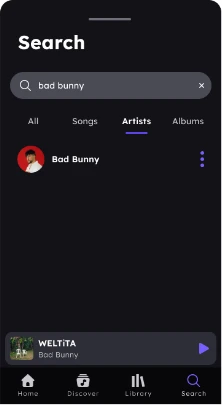
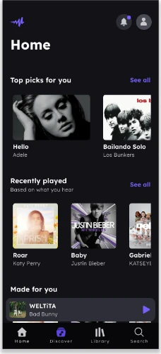
And in the dark-mode prototype, every transition is specified across the three critical flows:
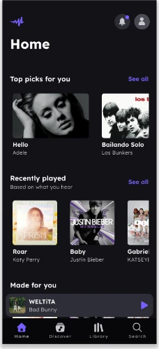
Play a song from a playlistMain flow
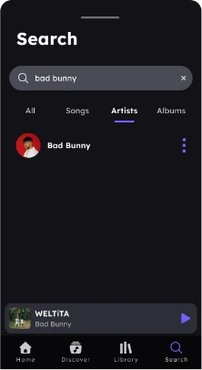
Search for a song / artist
Discover musicValue proposition
6Governance
To keep the system in order: a glossary, a convention for building tokens in three layers, and clear permissions.
- Primitive
primary-500 - Semantic
color-action-primary-default - Component
btn-primary-bg
6.1Glossary
- Primitive (base token)
- A raw value, color or number with no intended use. The system's lowest layer.
- Semantic token
- A token with an intended use that references a primitive (color-action-primary-default).
- Component token / alias
- A component-specific token that points to a semantic one (btn-primary-bg).
- Role
- The color's job in the UI: action, surface, outline, text, icon, status, accent.
- State
- Interaction condition: default, hover, active/pressed, disabled, on, container, on-container.
- Variant
- An alternative form of a component, size or style (button-sm, card-elevated).
- Type
- A component's structural class (two-lines vs one-line in list-item).
- Scale
- An ordered numeric progression: 4px for metrics, 50–900 for color, 50–600 for shapes.
- Surface / Container
- Surface hierarchy: default, dim, bright, container-lowest … container-highest.
- On-color
- The text or icon color that sits on a surface (color-on-primary).
- Temporal accent (Echo · Pulse · Bloom)
- Decorative accents tied to the product: Echo = past, Pulse = present, Bloom = future. Temporal use, not state.
- Status
- Feedback colors for the user: error, success, info, warning.
- Elevation
- Depth level expressed as shadow (50 / 100 / 200 / 300).
- Shape vs corner-radius
- shape = the rounding token; corner-radius = its actual value in px.
- Spacing / Margin / Padding / Gap
- Metric types within the 4px scale.
- Weight
- Type weight (weight-regular … weight-bold) on the Lexend family.
6.2Token naming convention
- Primitives / color
{palette}-{step}neutral-0 · primary-500 · echo-300 · pulse-500 · bloom-700 · error-500A raw color value with no intended use. Only semantic tokens reference them; they're never used directly in a component. - Semantic / color
color-{group}-{role}-{state}color-action-primary-default · color-surface-container · color-text-muted · color-accent-echo-hoverThey add intent. Groups: action, surface, outline, text, icon, accent-(echo|pulse|bloom), status. - Component tokens
{component}-{part}-{property}btn-primary-bgThe top layer: the component points to a semantic token through this alias. It's the token the component actually uses. - Typography
{style}-{property}h1-size · subtitle2-size · body2-lineheight · weight-semibold · family-fontStyles: h1–h6, subtitle1–2, body1–2, button, caption, overline. Properties: size, weight, spacing. - Shape
shape-{step} | corner-radius-{step}shape-100 · corner-radius-200 (12px) · corner-radius-500 (24px) · corner-radius-600 (28px)shape = the rounding token; corner-radius = its value in px. - Metrics / spacing
{type}-{value}spacing-8 · margin-16 · padding-12 · gap-24A 4px base scale (4–72). Types: spacing, margin, padding and gap. - Elevation
elevation{level}-{property}elevation200-y · elevation200-blur · elevation200-spreadLevels 50, 100, 200 and 300 (higher means deeper). Properties: x, y, blur, spread.
6.3Permissions
A timeline of your listening: proof that you got there first.