Consorcio
Studio


Your bank, arranged
the way you want.

- Role
- UX/UI, research, concept and prototype
- Team
- With Sofía Oñate
- Timeline
- 1 semester
- Tools
- Figma
Consorcio Studio is a space inside the Consorcio app where everyone sets up their banking their own way: rearranging the home screen around what they use most and choosing how the app sounds. I developed it with Sofía Oñate in UDD's Interaction Studio IV, from research to a prototype validated with users.
Problem
- Irrelevant information
- 90%
- Get frustrated when the app shows what they don't need
- Want personalization
- 72%
- Demand it because of their current app's friction
- More security
- 60%
- Trust an app that adapts to them more
- Weekly use
- 78%
- Use their mobile bank every week
Sources: Forrester (2023), Deloitte (2024), Adobe (2024), UXDA (2025).
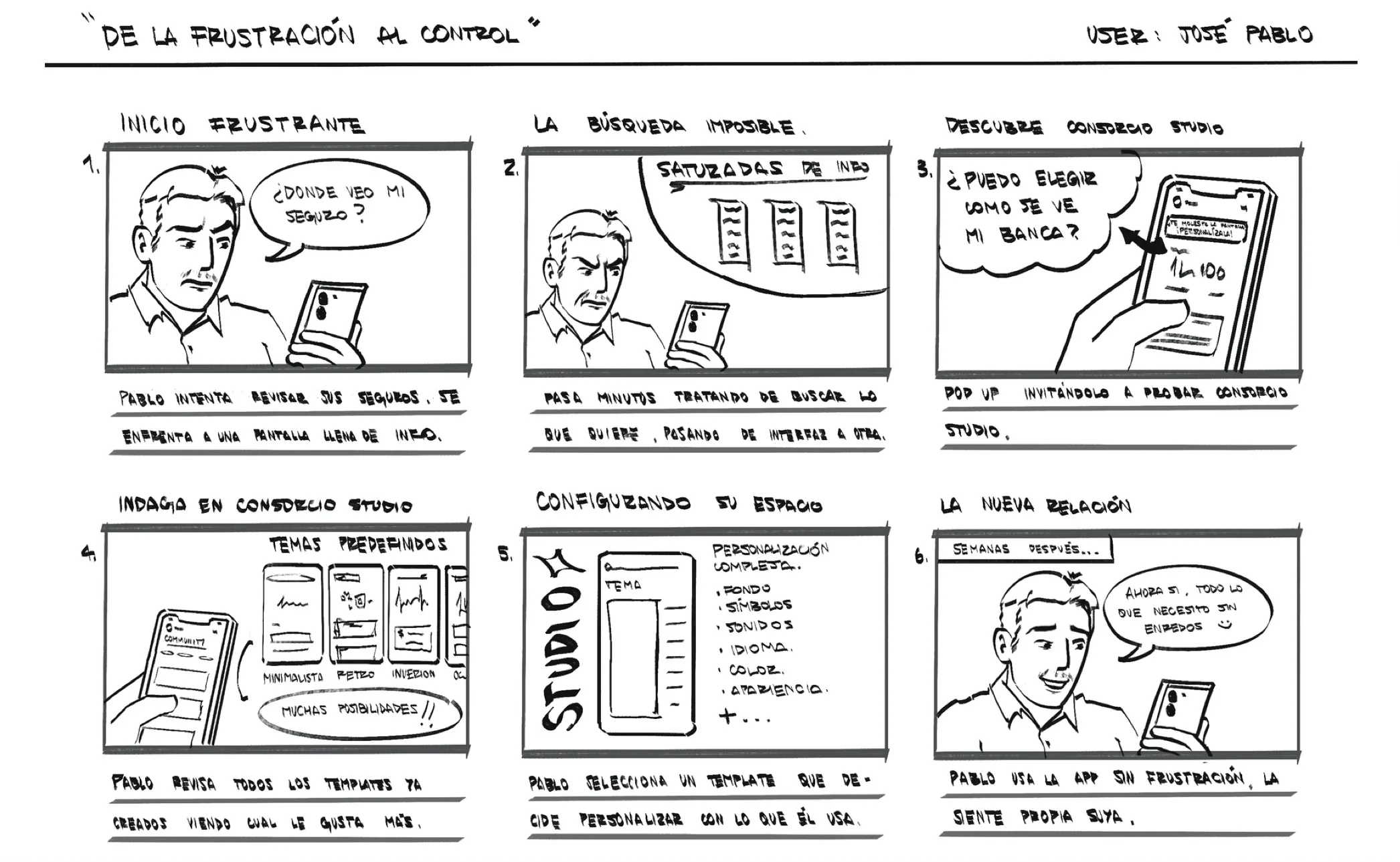
His bank's app doesn't adapt to him. Instead of making his finances easier, it floods him with information and ads.
José Pablo, 44, our user persona
Concept
We started from a hypothesis: if we personalize the banking experience, visually and emotionally, friction goes down and the sense of control and security goes up.

Designingyour own space

We broke it down into three jobs users need done when they open their bank:
- 1.See what I use first
- 2.Know my transfer went through
- 3.Feel my bank is modern and reliable
Your bank, your pace, your way.
Process
The first version was a full studio: templates, a live preview of the home screen and the option to edit or replace each module, with themes you could save.
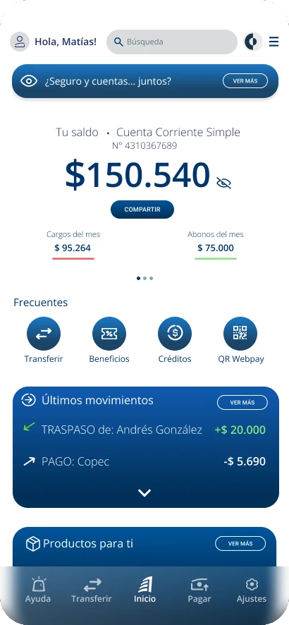 01Redesigned homeFewer banners and the essentials first: balance, recent shortcuts and transactions.
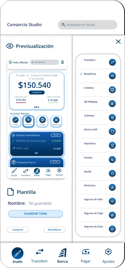 02MVP: template studioEach home module could be edited or swapped for another from a panel.
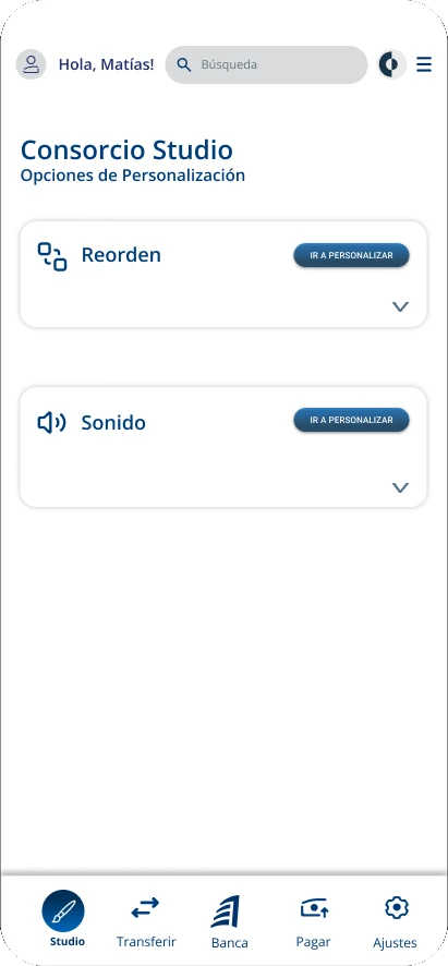 03Final: Reorder and SoundTwo features, one per pillar: control and feedback.
We tested it with 20 users in two studies: a usability test, with tasks like changing the template or adding an insurance module, and a Kansei test, which measures whether the experience feels the way we promised.
- IntuitiveComplicated
- PersonalizedGeneric
- EmpatheticDistant
- HarmoniousChaotic
- UnderstandingCold
- OrganicArtificial
For the final delivery we narrowed the studio down to two features: Reorder, to be in control of the home screen, and Sound, to confirm what matters without having to look twice.
Product
Studio lives in the tab bar, next to Home. Reorder shows a preview of the home where every module works like a widget: drag it somewhere else or drag the one you want on top of it (balance, investments, insurance, upcoming payments, accounts…), and quick actions reorder and swap the same way. Sound lets you pick one of four styles, Modern, Discreet, Retro and Essential, or silence.
 Hola, Matías!
Tu saldo Cuenta Corriente Simple
N° 4310367689
$150.540
 Cargos del mes$ 95.264
 Abonos del mes$ 75.000
Recientes
 Últimos movimientos
 TRASPASO de: Andrés González+$ 20.000
 PAGO: Copec-$ 5.690
 Productos Para tí
 Beneficios
Try it yourself
This is Consorcio Studio, working. Tap Studio in the tab bar. In Reorden, tap EDITAR and drag: a widget from the panel onto a box in the preview, one box onto another to swap them, or a quick action to another spot. You will see it on Inicio. In Sonido, pick a style and make a transfer to hear it. The app itself is in Spanish, like the real one.
Turn your volume up
Each style has five sounds: buttons, notifications, alerts, transfers and money received. The idea comes from a gap: digital banking relies only on visual confirmations, which are easy to miss, and doubt after a transfer is one of our user's fears.
We validated the final proposal with 12 users on a Likert scale.
- ReorderPerceived controlHow in control of your own banking did you feel?
- 91.7%
- SoundPerceived securityHow much trust in your bank did this feature give you?
- 100%
Likert scale · 12 users
Our goal is banking with
−Friction+Clarity+Control